12
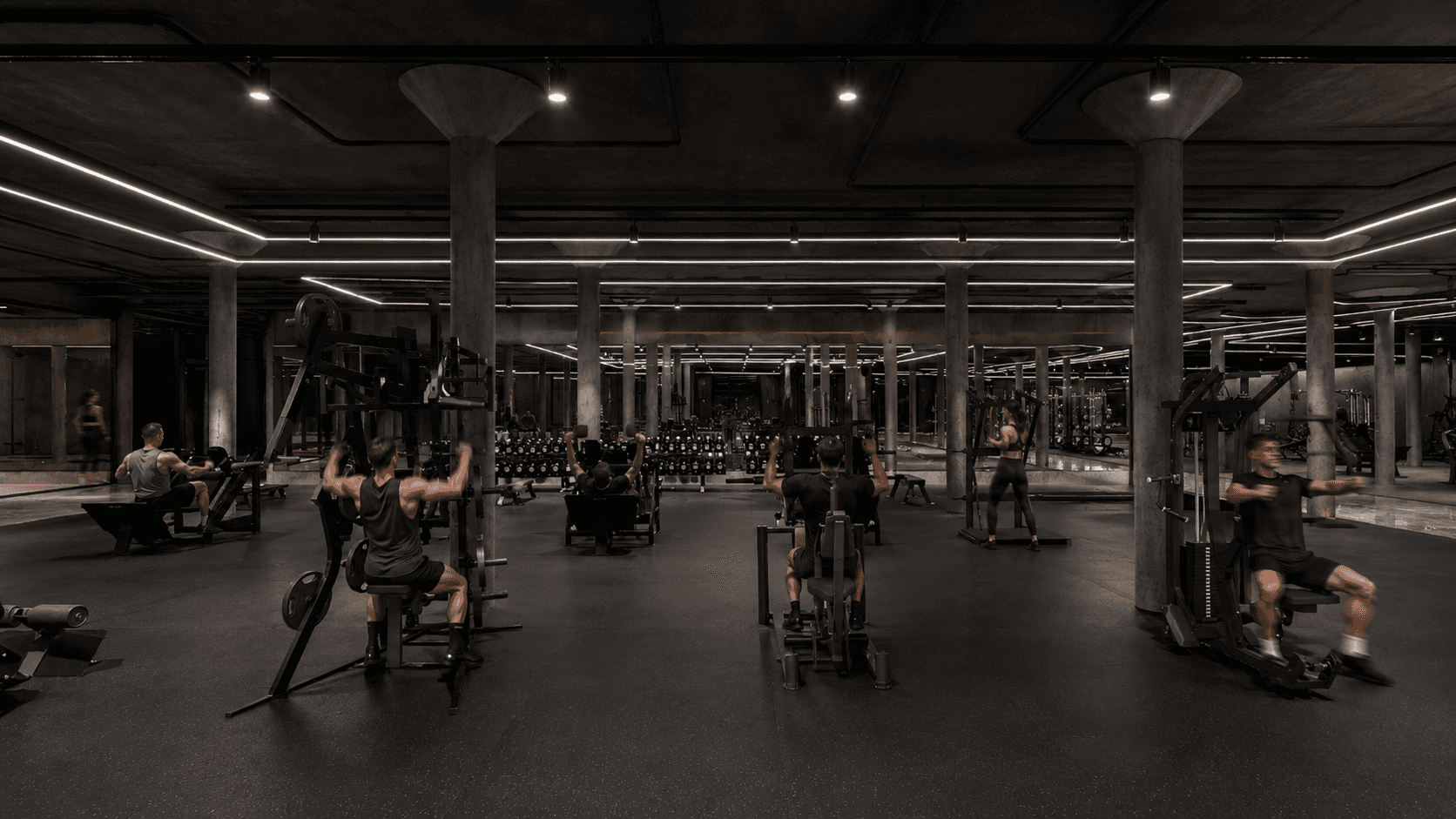
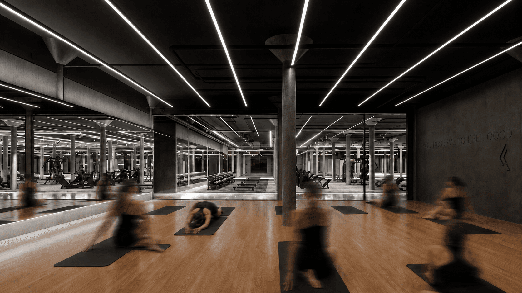
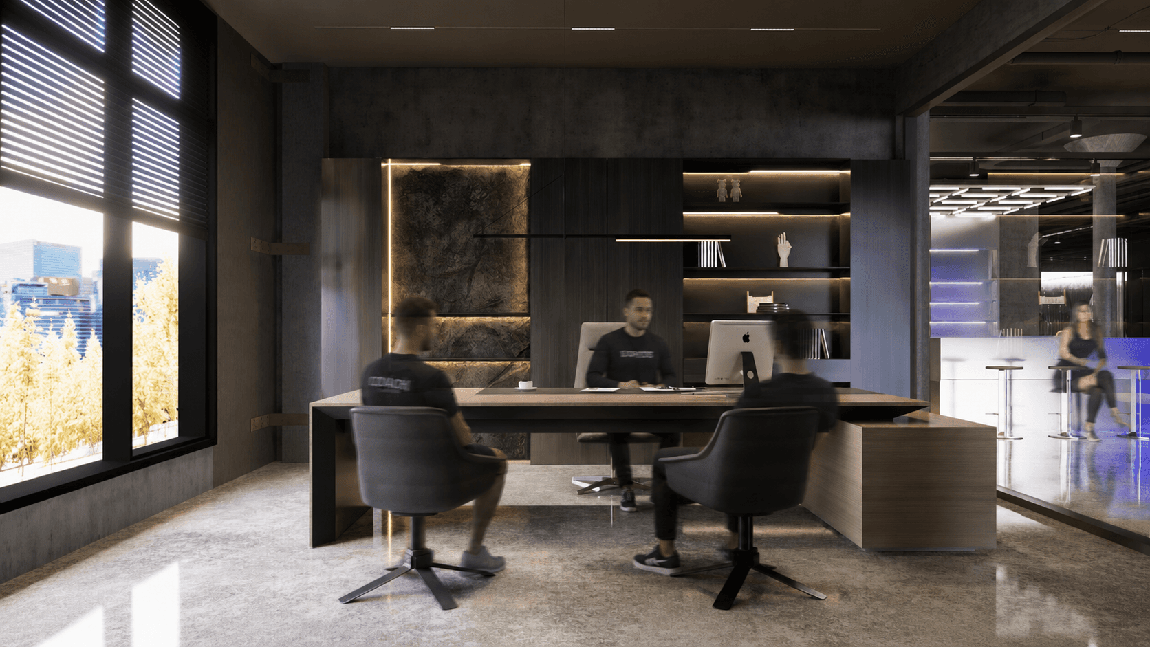
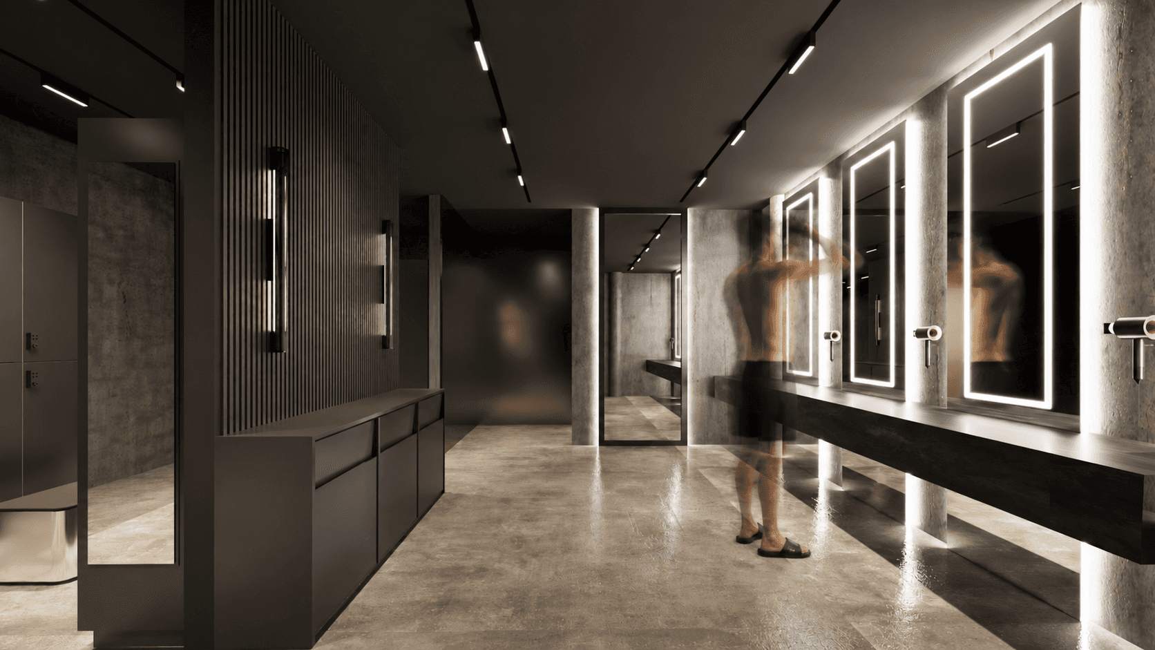
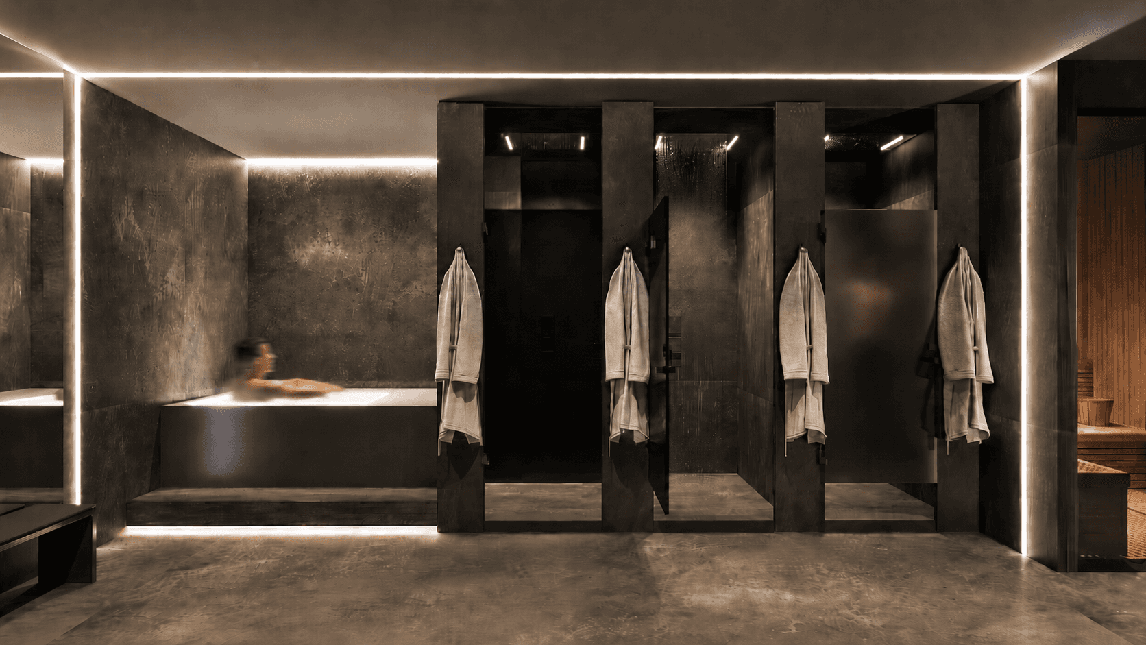
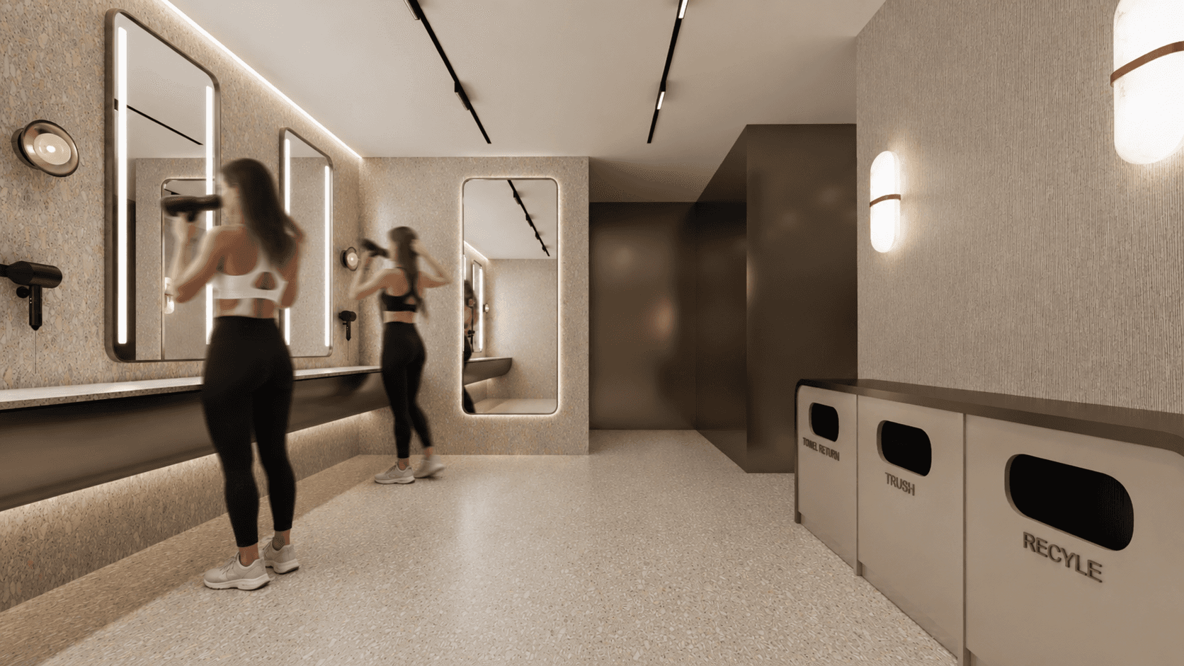
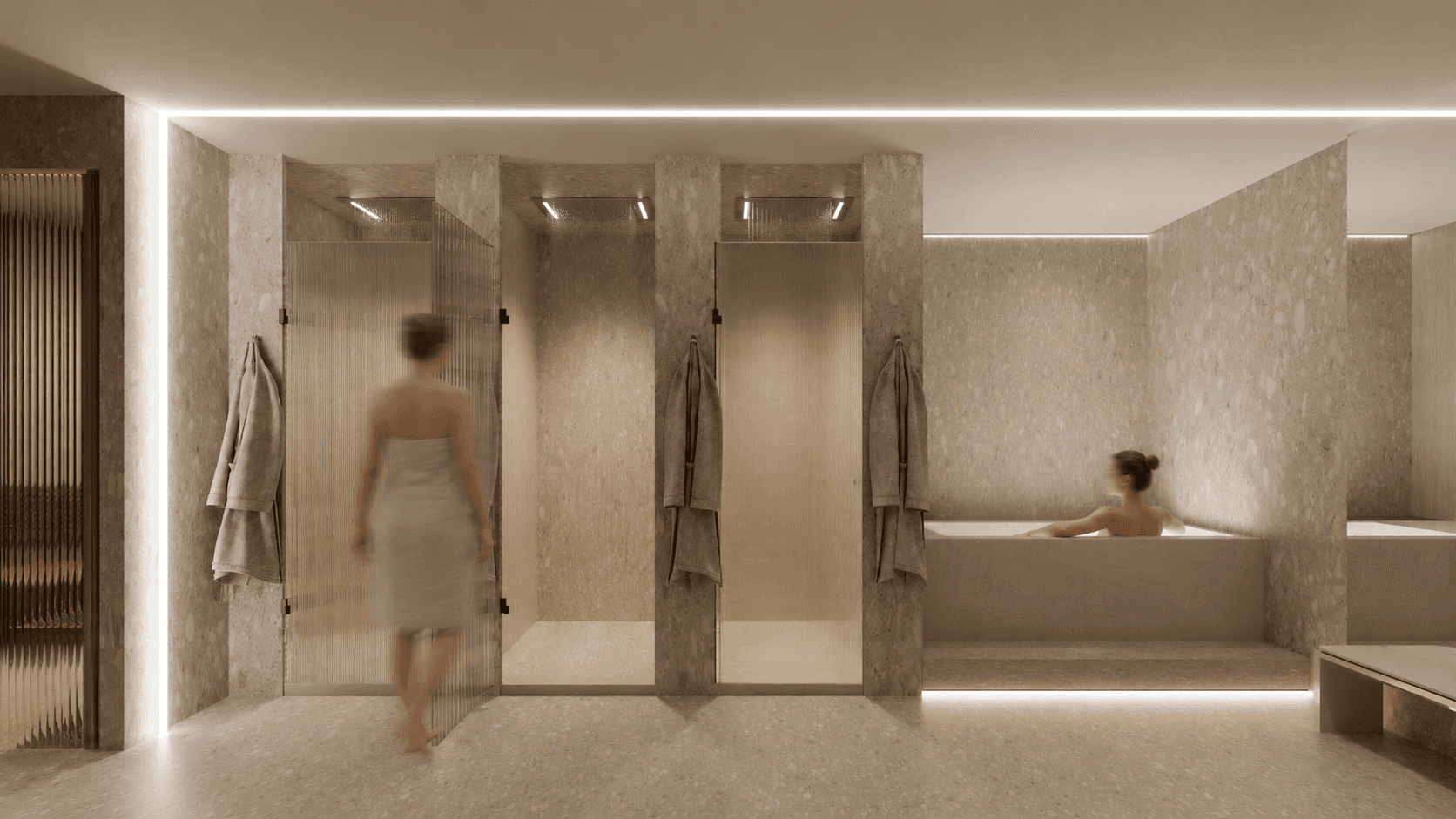
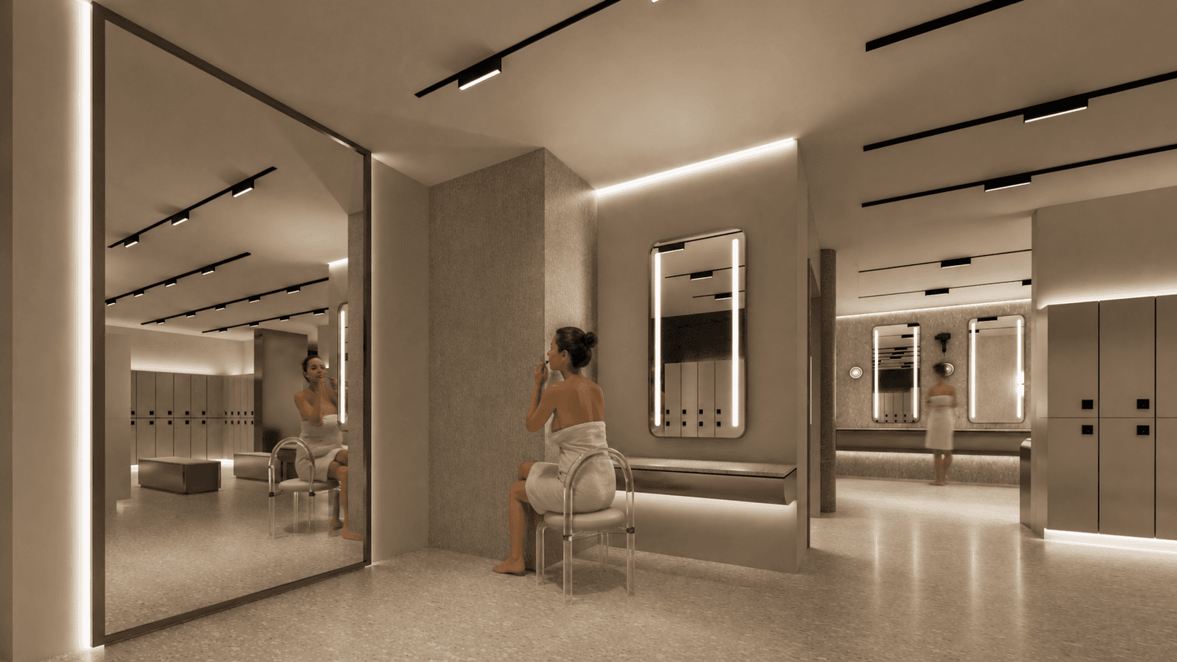
Sky Fitness is a multi-functional fitness destination designed to do more than house workouts. The project extends a bold, kinetic brand identity into a full spatial experience — covering the main training floor, retail zone, in-house café, locker rooms, and the owner's private office. From brand touchpoints down to the smallest detail, the design was approached as one continuous environment built around how members actually move, rest, and connect throughout their day.
CLIENT
SKY FITNESS
ROLE
SPATIAL DESIGN & BRAND INTEGRATION
RESPONSIBILITIES
SPATIAL / RETAIL / F&B / BRAND ENVIRONMENT
YEAR
2024
LOCATION
OAKVILLE, ON
THE BRIEF
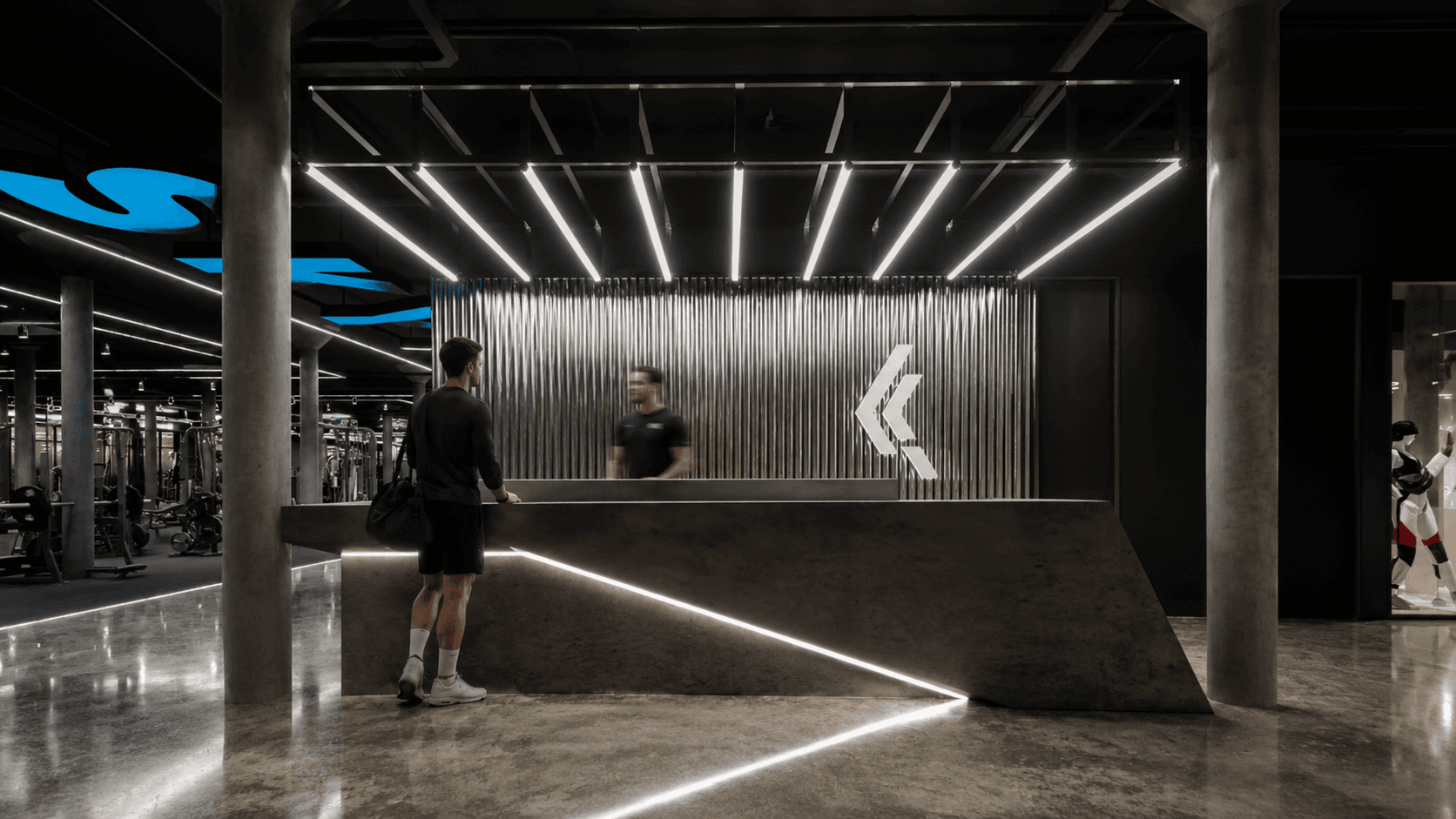
THE CONCEPT
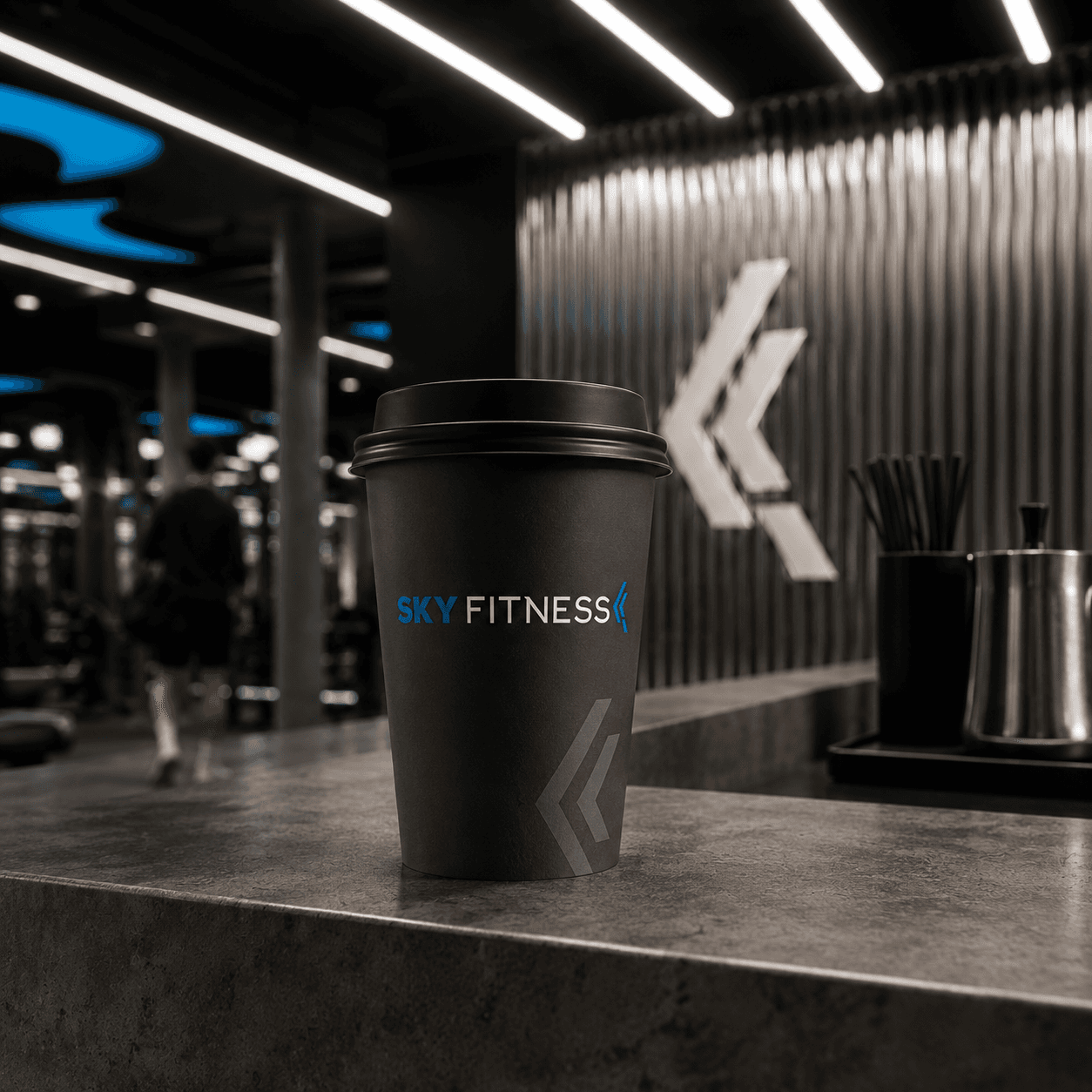
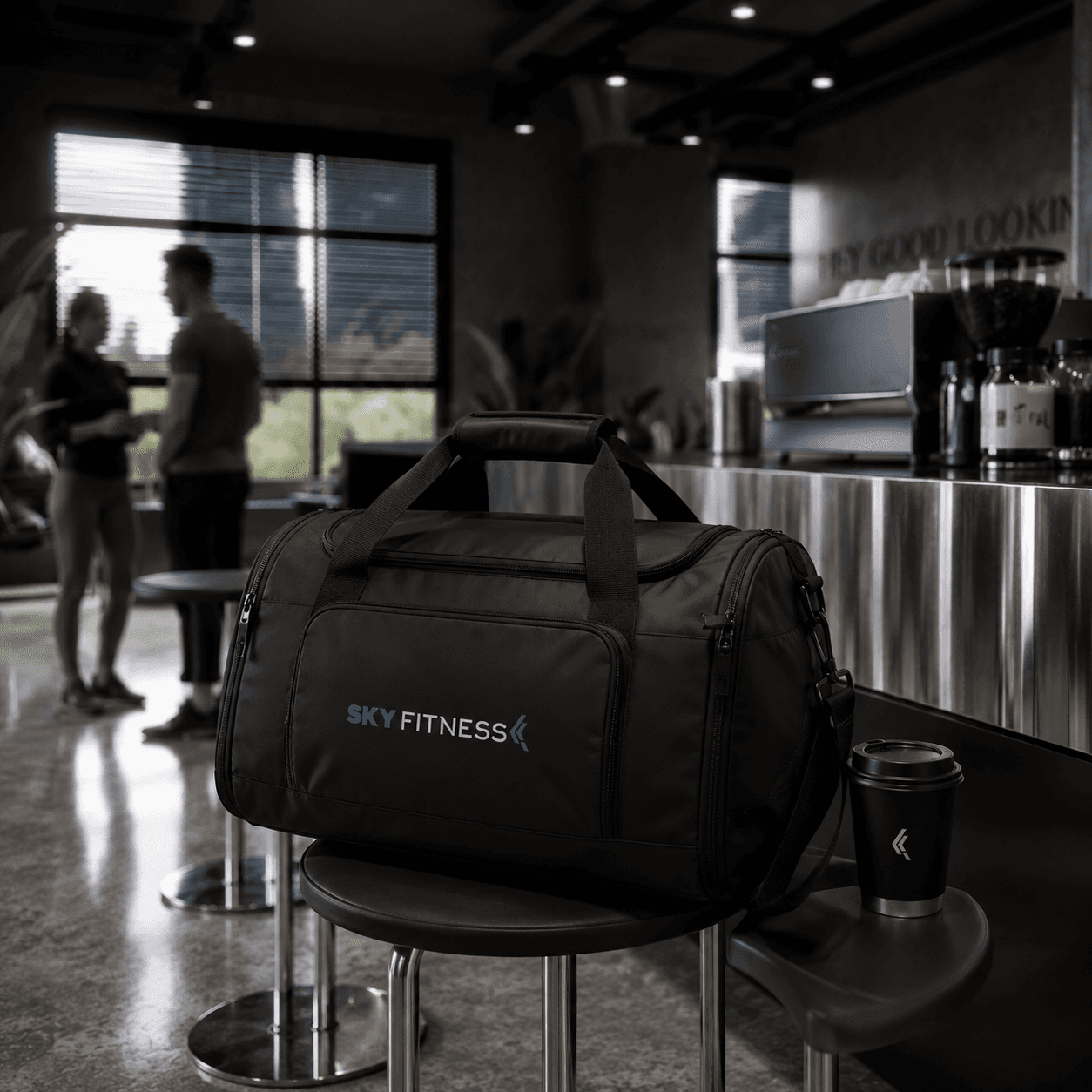
BRAND IN HAND
Packaging, apparel, and accessories were designed as extensions of the space itself — so the brand stays with the member long after they leave the floor.
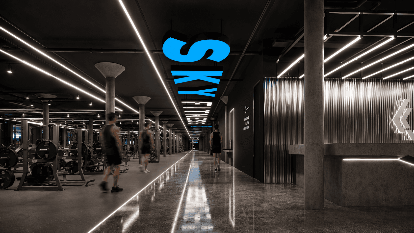
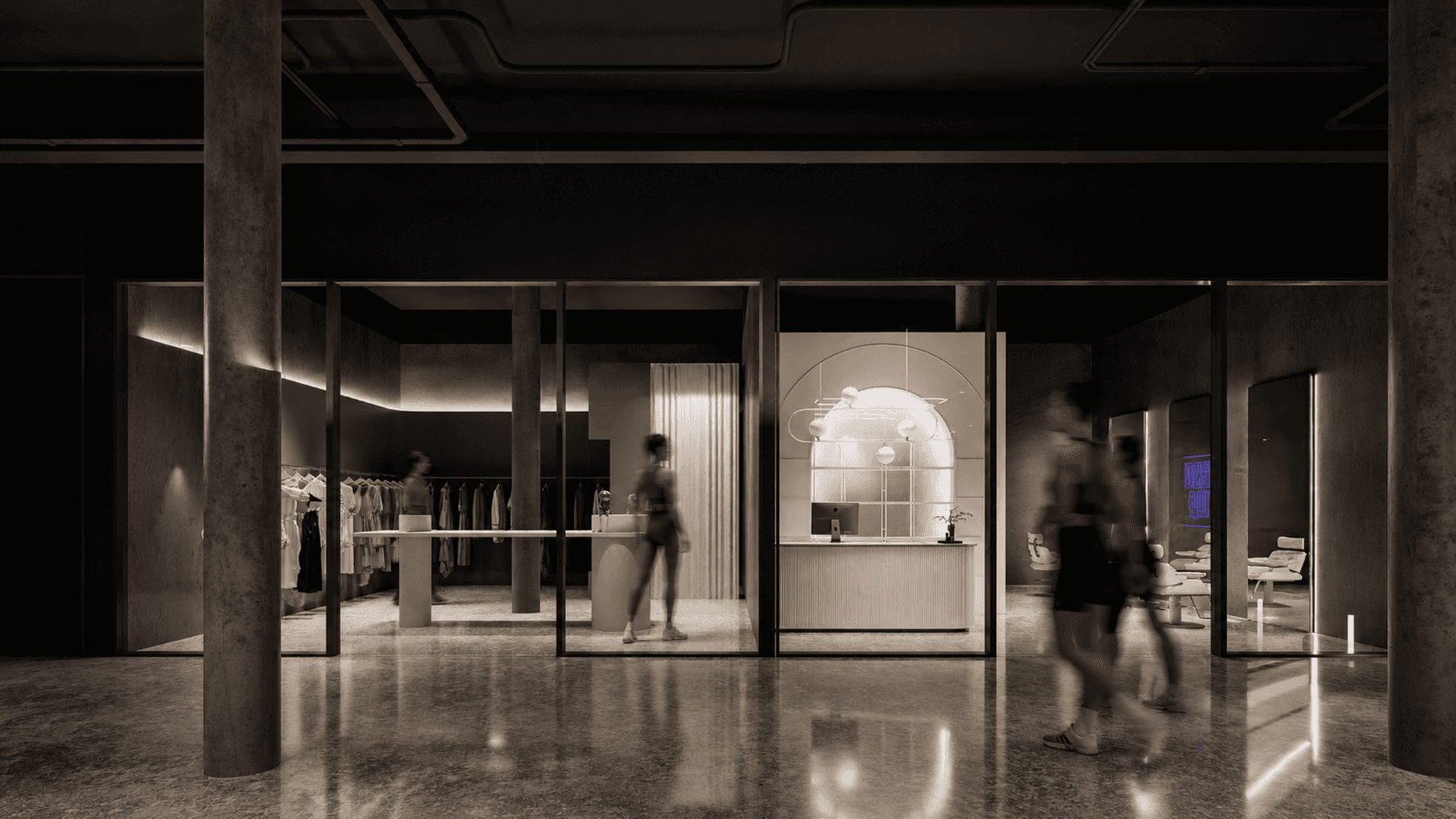
Rather than isolating retail in its own room, the layout integrates it into the member's daily flow. Strategic placement along high-traffic touchpoints, clear sightlines into the product, and consistent material language all work together to lower the barrier between training and shopping — turning retail into an extension of the experience rather than a separate transaction.
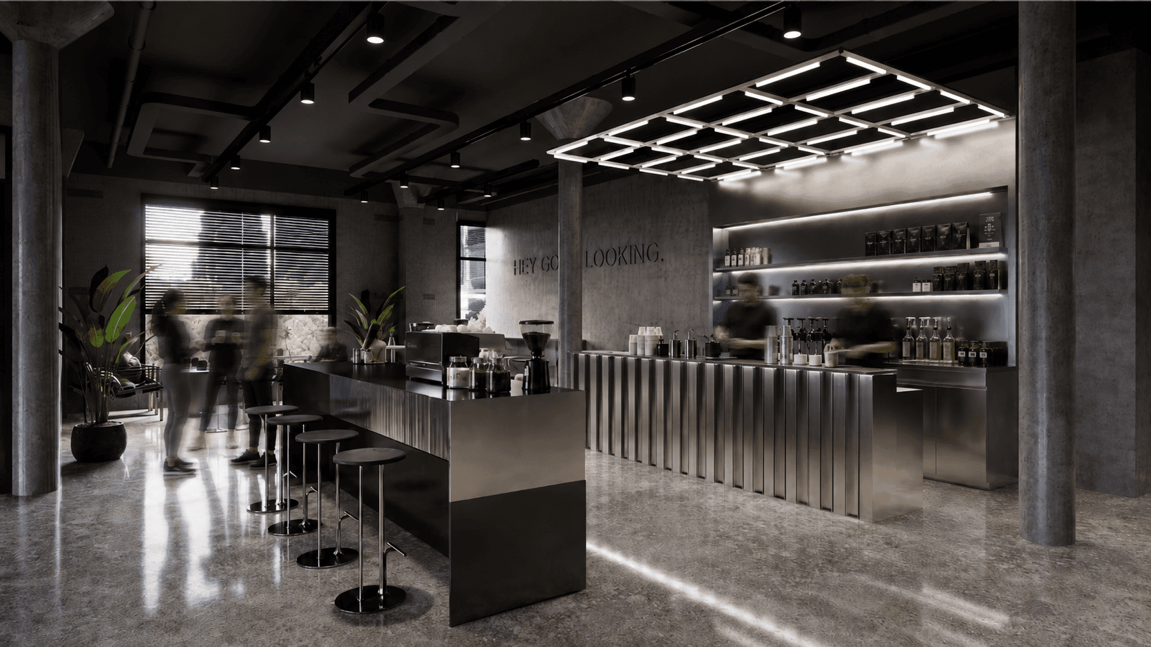
Fitness today isn't only about the workout — it's about the hours around it. The in-house café was designed as a natural extension of the training floor, offering members a place to slow down, refuel, and stay connected. Softer lighting, warmer tones, and casual seating create a quieter counterpoint to the intensity of the gym, allowing the space to shift modes alongside its users — from high-energy training to casual community, all within the same brand world.

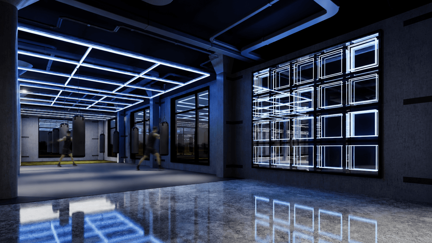
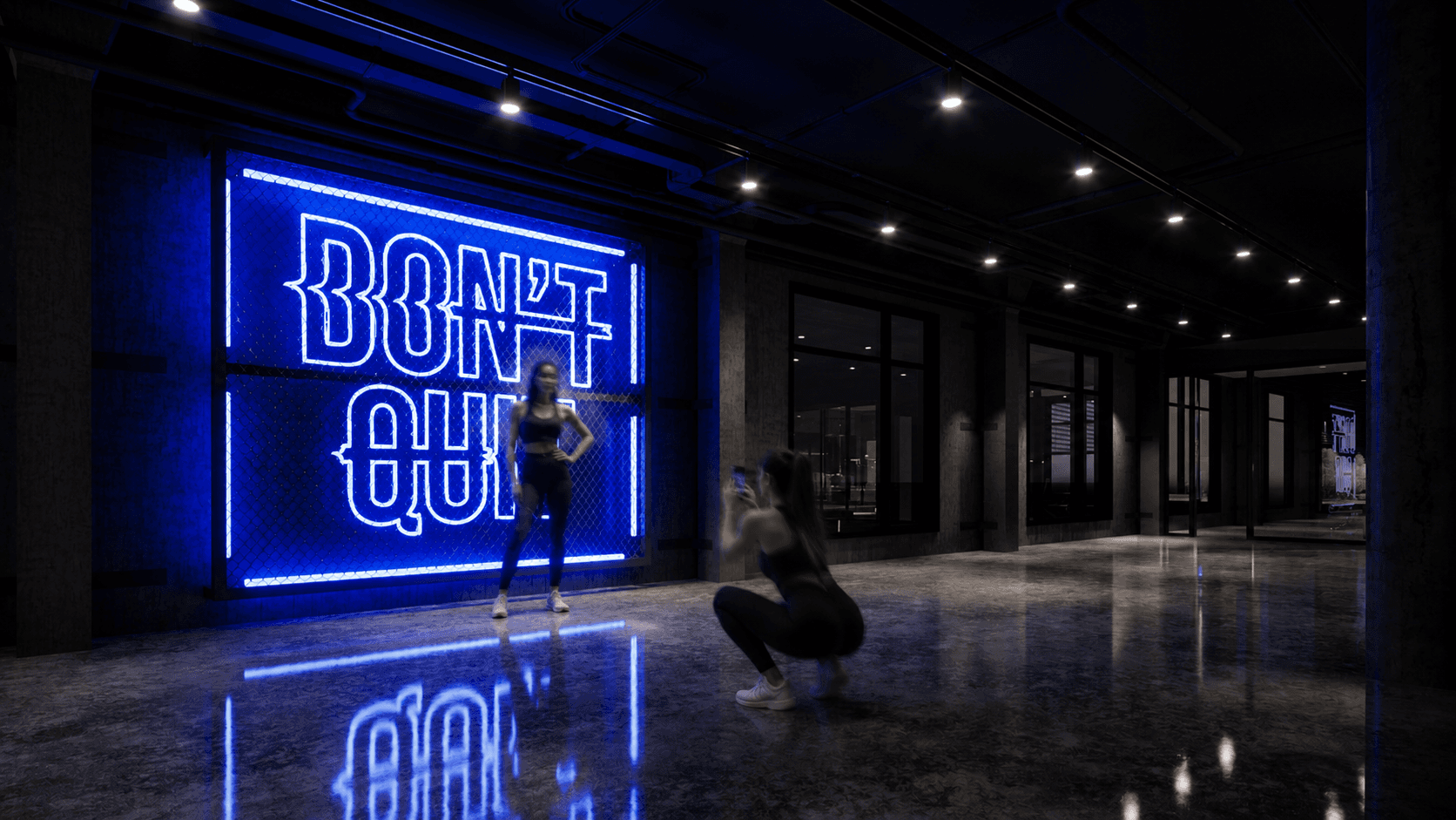
BRAND EXPERIENCE
© KATHRYN XU
© 2026