06
SENCHA — BRAND INTEGRATION & STORE DESIGN
SENCHA — BRAND INTEGRATION & STORE DESIGN
SENCHA — BRAND INTEGRATION & STORE DESIGN
A quiet translation of brand into space — where the name Sen (森) becomes more than a word, but the atmosphere you step into. This project reimagines a tea house as a living extension of its identity: a forest, distilled.
CLIENT
SEN CHA
ROLE
SPATIAL DESIGN & BRAND INTEGRATION
LOCATION
TORONTO, ON
YEAR
2026
SEN CHA
SENCHA — BRAND INTEGRATION & STORE DESIGN
THE BRIEF
Sen Cha approached us with a clear intention: to build an interior that doesn't describe the brand, but embodies it. Rooted in Japanese minimalism and the philosophy of returning to nature, the space was designed to feel less like a retail environment and more like a quiet clearing — somewhere guests pause, breathe, and reconnect with the essence of tea.
Sen Cha approached us with a clear intention: to build an interior that doesn't describe the brand, but embodies it. Rooted in Japanese minimalism and the philosophy of returning to nature, the space was designed to feel less like a retail environment and more like a quiet clearing — somewhere guests pause, breathe, and reconnect with the essence of tea.
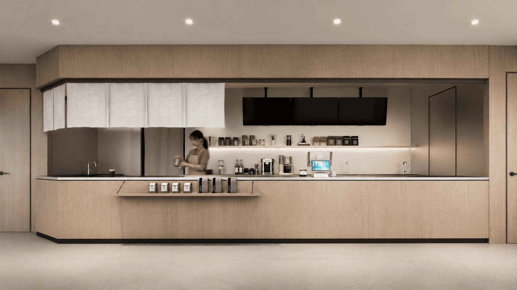
A modern Japanese-inspired tea house — where brand language, material, and stillness converge.
A modern Japanese-inspired tea house — where brand language, material, and stillness converge.
THE CONCEPT
The concept began with a single word: Sen (森) — forest. In Japanese, sencha refers to the most everyday, honest form of green tea; in Chinese, sen evokes the depth and calm of woodland. I took both meanings as our starting point.
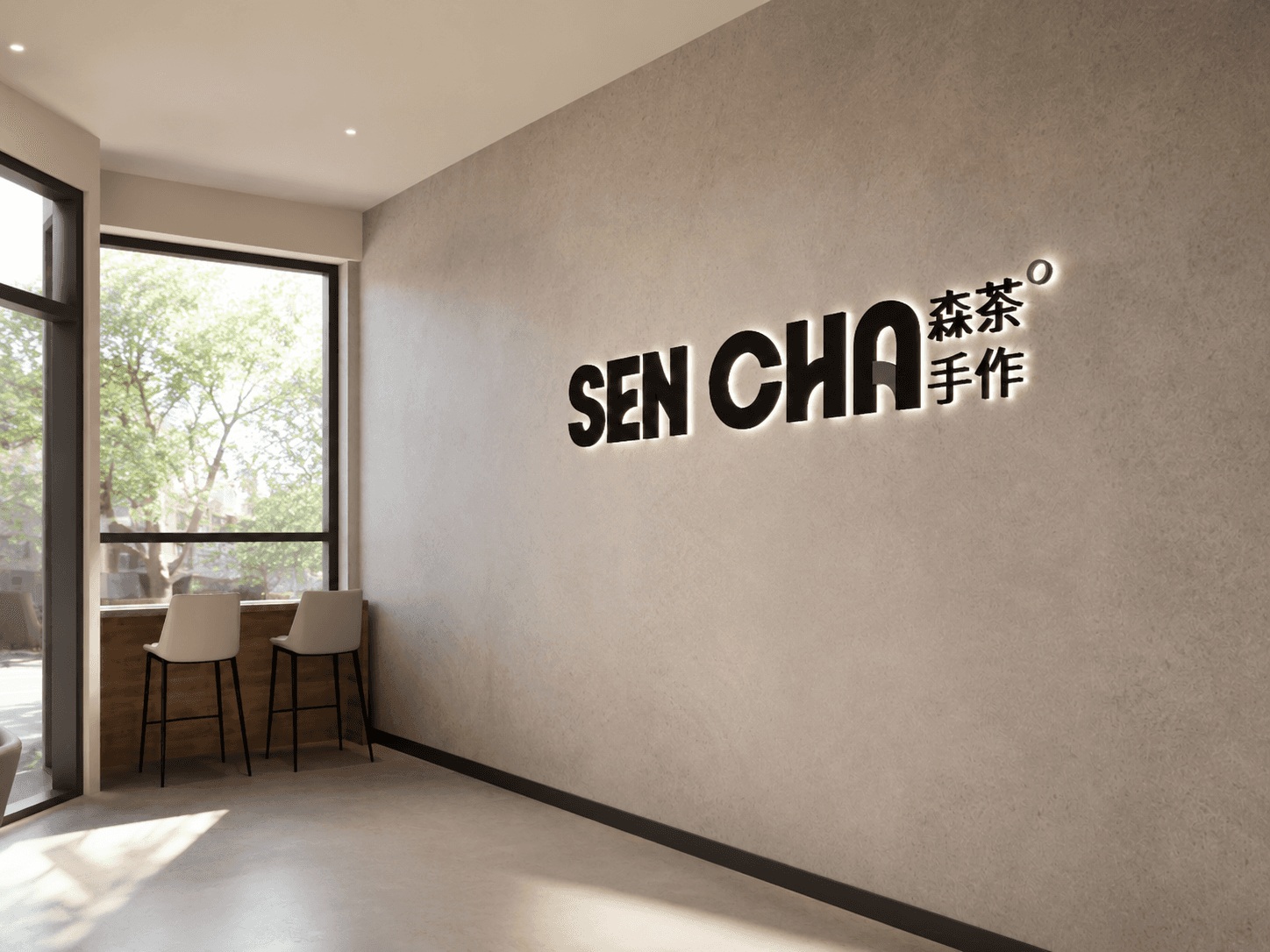
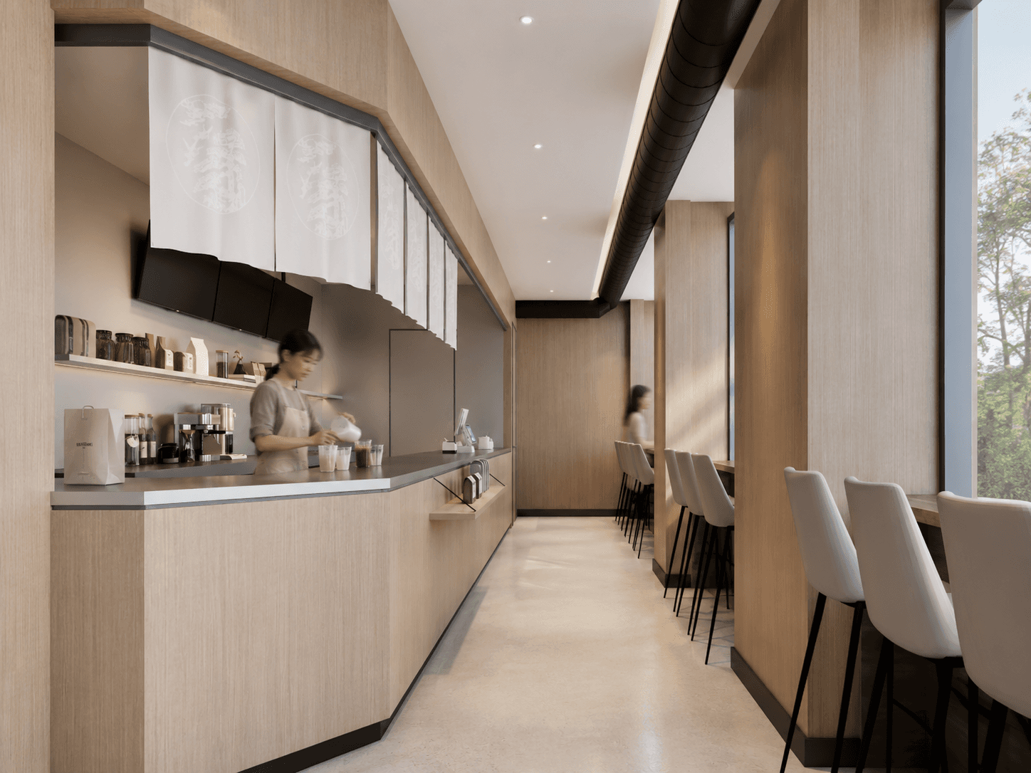
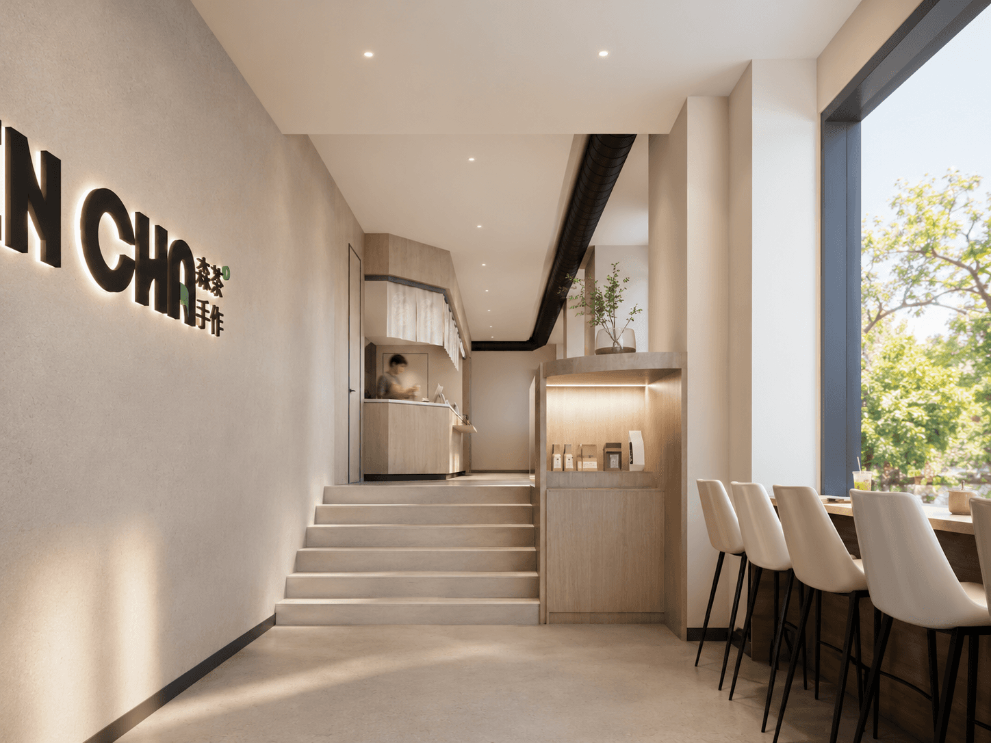
Rather than illustrating "nature" through decoration, we stripped the space down to its most essential materials — raw timber, unfinished plaster, paper, and stone. Each surface was chosen for what it is, not what it represents. The result is a room that breathes the same language as the brand: clean, grounded, and unmistakably natural without ever announcing itself.
The concept began with a single word: Sen (森) — forest. In Japanese, sencha refers to the most everyday, honest form of green tea; in Chinese, sen evokes the depth and calm of woodland. I took both meanings as our starting point.
Rather than illustrating "nature" through decoration, we stripped the space down to its most essential materials — raw timber, unfinished plaster, paper, and stone. Each surface was chosen for what it is, not what it represents. The result is a room that breathes the same language as the brand: clean, grounded, and unmistakably natural without ever announcing itself.
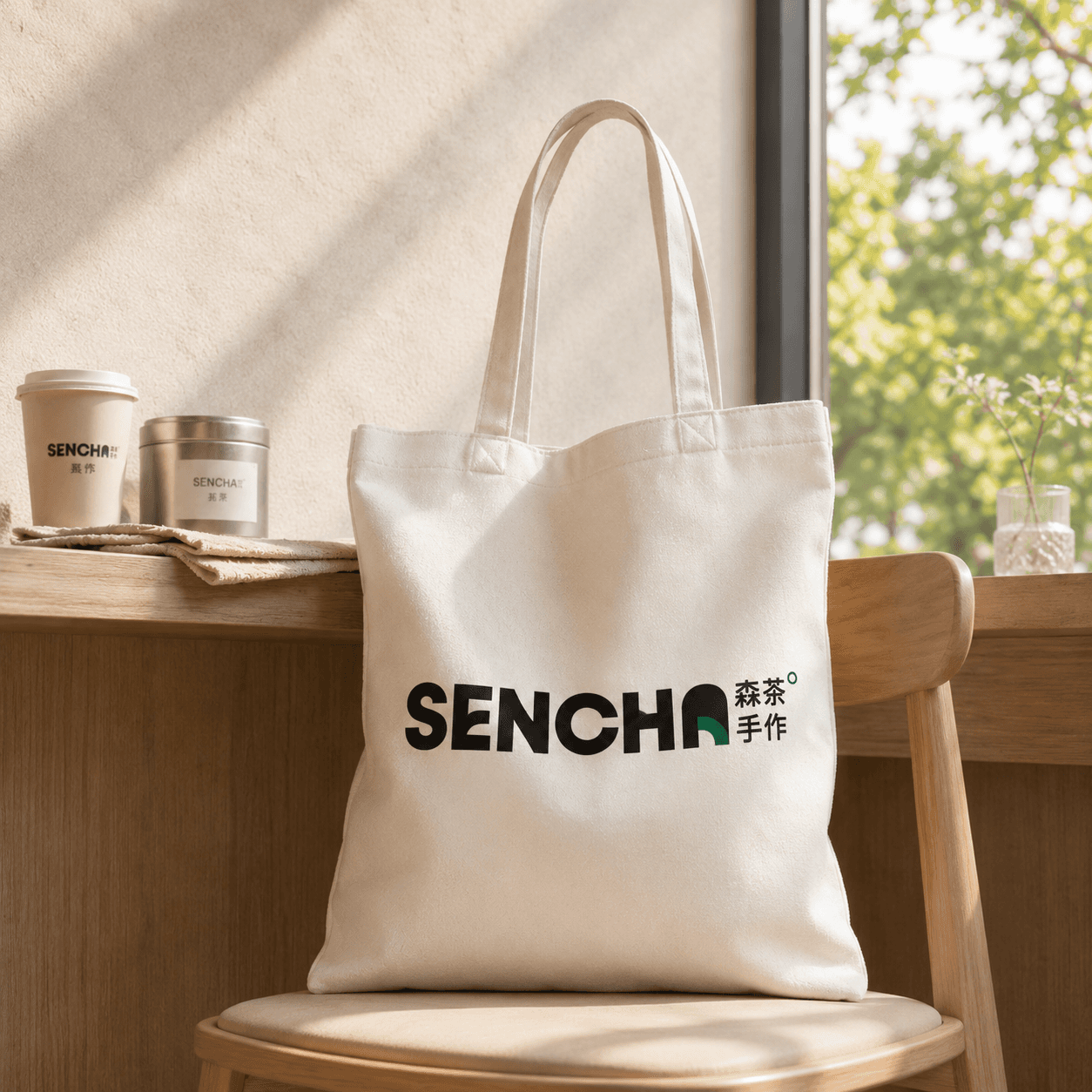
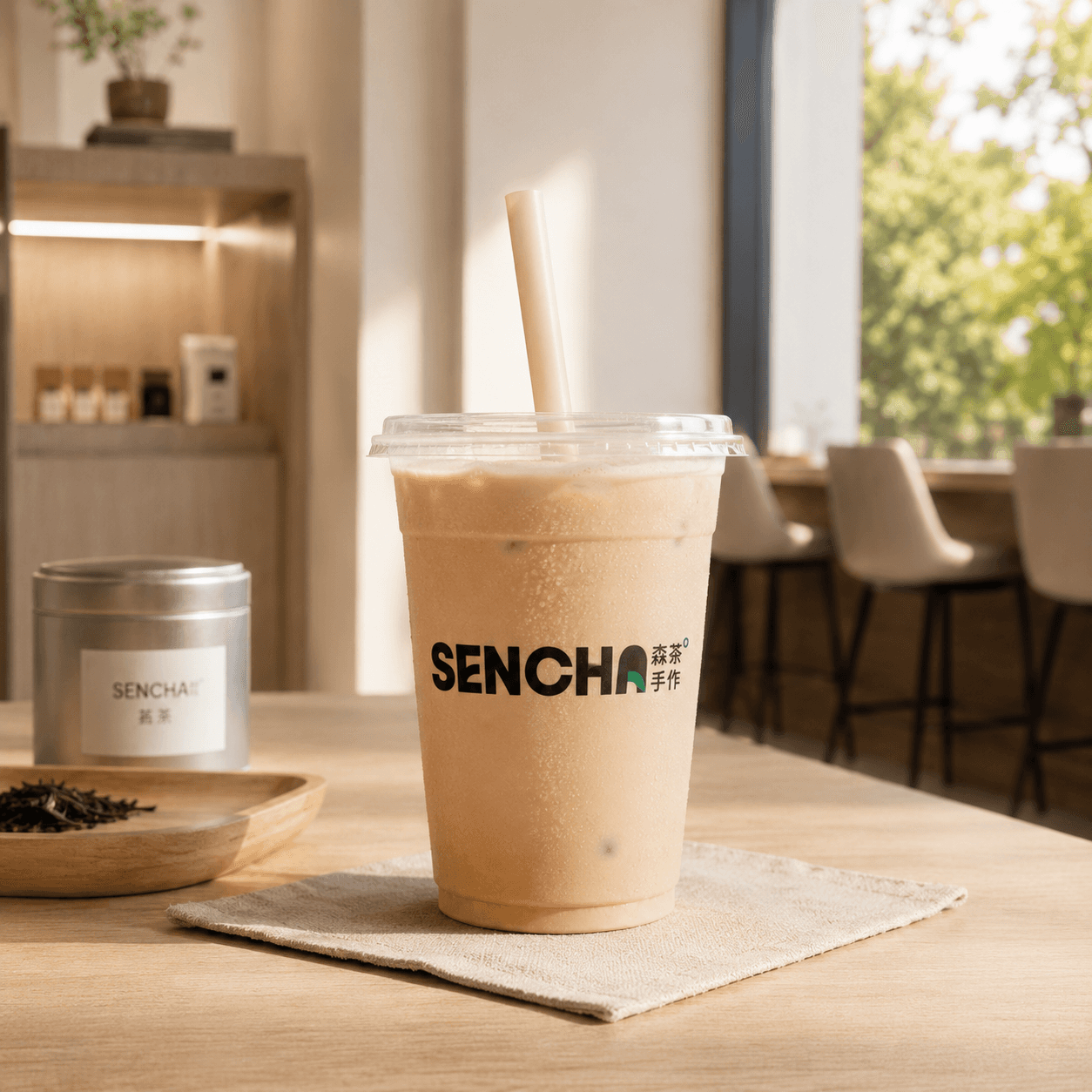
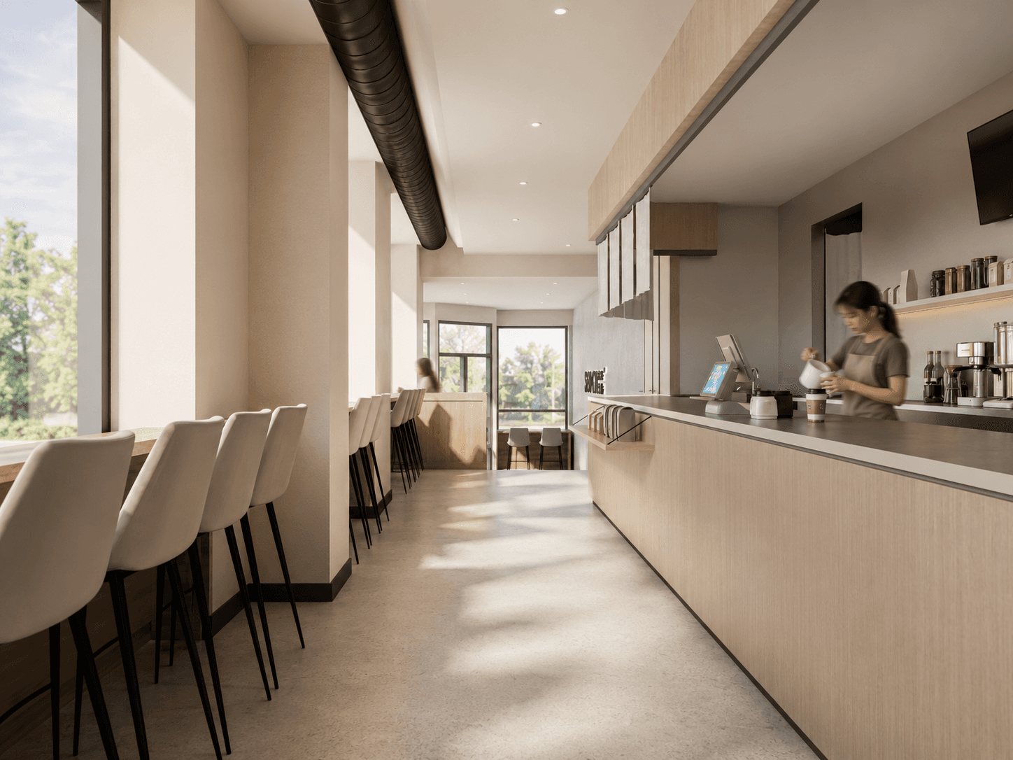
Light moves through the space the way it moves through a forest canopy — soft, diffused, never direct. Sightlines are kept low and horizontal, drawing the eye toward texture rather than ornament. Every element, from the counter's single slab of wood to the muted earthen walls, was considered as part of one continuous gesture: brand made tangible.
Light moves through the space the way it moves through a forest canopy — soft, diffused, never direct. Sightlines are kept low and horizontal, drawing the eye toward texture rather than ornament. Every element, from the counter's single slab of wood to the muted earthen walls, was considered as part of one continuous gesture: brand made tangible.
FROM FOREST TO ROOM
Sen Cha is, in the end, an exercise in restraint. By holding back — in palette, in form, in noise — the interior allows the brand's quiet philosophy to take the lead. What's left is something rare in a commercial space: a sense of natural ease. A small forest, held inside four walls.
Sen Cha is, in the end, an exercise in restraint. By holding back — in palette, in form, in noise — the interior allows the brand's quiet philosophy to take the lead. What's left is something rare in a commercial space: a sense of natural ease. A small forest, held inside four walls.
© KATHRYN XU
© 2026