08
POKE BOX — BRAND INTEGRATION & STORE DESIGN
POKE BOX — BRAND INTEGRATION & STORE DESIGN
POKE BOX — BRAND INTEGRATION & STORE DESIGN
A neighbourhood poke shop reimagined as a coastal vignette — where the brand's existing fish logo finally has a sea to live in.
CLIENT
THE POKE BOX
ROLE
SPATIAL DESIGN & BRAND INTEGRATION
LOCATION
TORONTO, ON
YEAR
2026
THE POKE BOX
POKE BOX — BRAND INTEGRATION & STORE DESIGN
THE BRIEF
The brief for Poke Box's new location called for a store environment that felt site-specific and experientially distinct, while maintaining coherence with the brand's established visual identity. Having previously contributed to the development of Poke Box's spatial and brand direction, I approached this project as an evolution of that language — deepening the brand story through colour, materiality, lighting, signage, and spatial detail rather than replicating an existing formula.
The brief for Poke Box's new location called for a store environment that felt site-specific and experientially distinct, while maintaining coherence with the brand's established visual identity. Having previously contributed to the development of Poke Box's spatial and brand direction, I approached this project as an evolution of that language — deepening the brand story through colour, materiality, lighting, signage, and spatial detail rather than replicating an existing formula.
My role focused on translating the brand system into a physical interior environment, from spatial planning and material direction to feature elements, lighting atmosphere, and customer flow. The goal was to strike a balance between consistency and distinctiveness — creating a space that feels unmistakably Poke Box while responding to the specific conditions of this location, and ensuring a seamless continuity of brand identity from visual language through to built space.
My role focused on translating the brand system into a physical interior environment, from spatial planning and material direction to feature elements, lighting atmosphere, and customer flow. The goal was to strike a balance between consistency and distinctiveness — creating a space that feels unmistakably Poke Box while responding to the specific conditions of this location, and ensuring a seamless continuity of brand identity from visual language through to built space.

THE CONCEPT
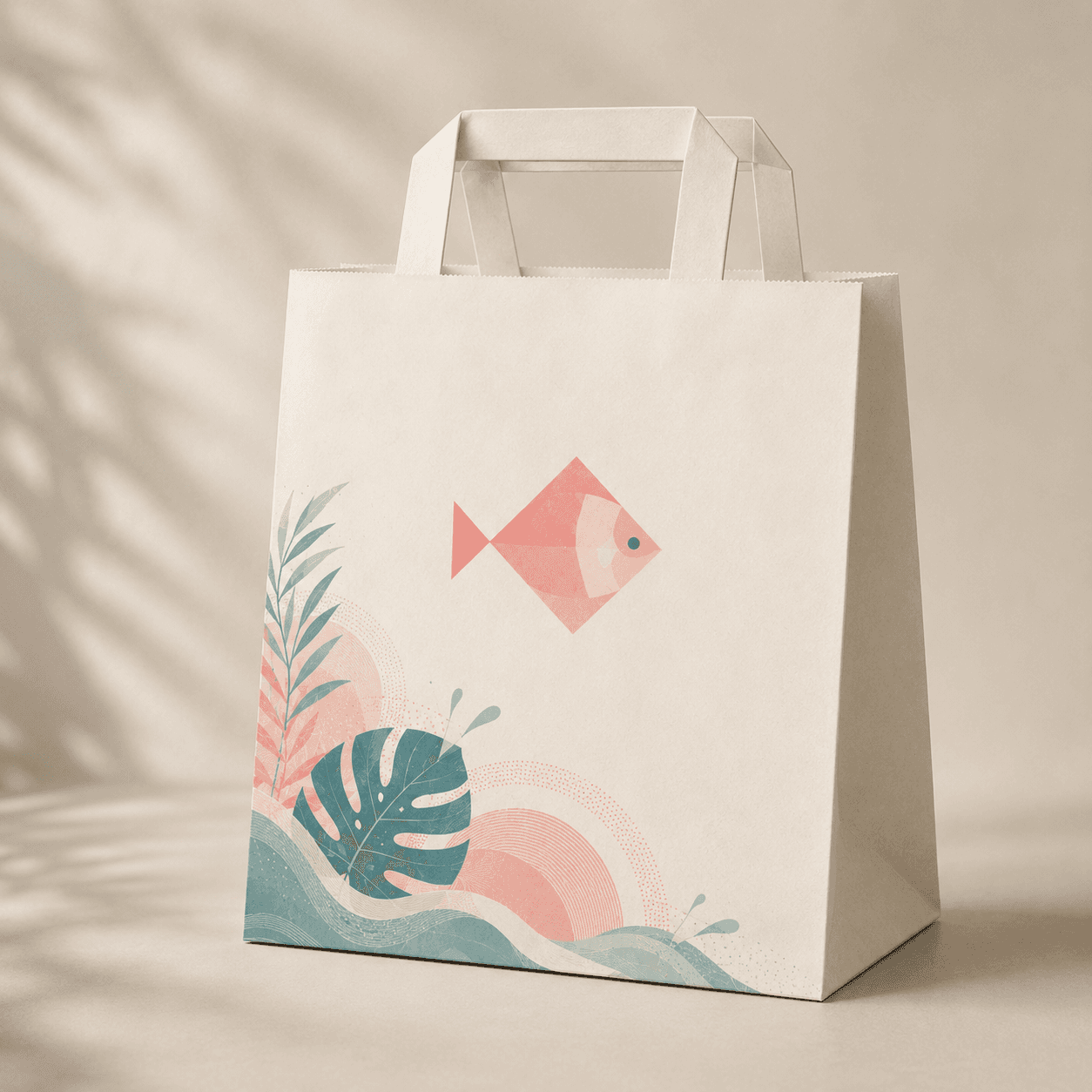
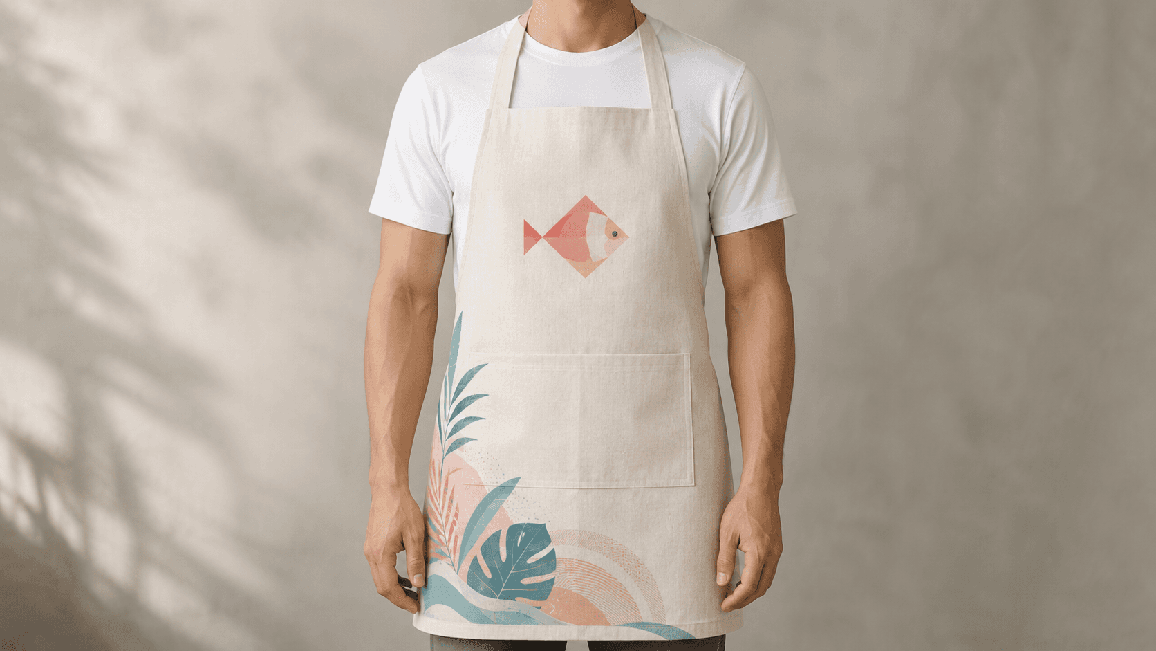
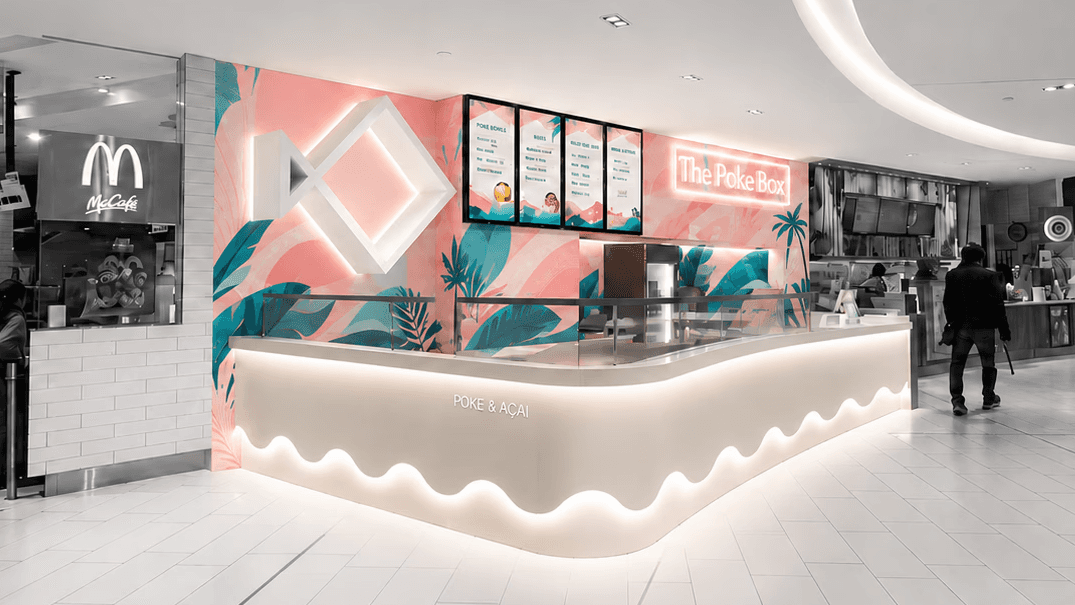
The concept draws inspiration from the ocean and the freshness associated with Poke Box's brand identity. The wave form on the counter represents the movement of the sea, visually connecting to the brand's fish logo as if the fish is jumping out of the waves. Instead of expressing freshness through literal greenery or murals, the design uses form, materiality, and lighting to create a more subtle and dynamic brand experience. White barn wood introduces a coastal, beach-house feeling, while the neon-style signage reinforces the lively seaside atmosphere.
The concept draws inspiration from the ocean and the freshness associated with Poke Box's brand identity. The wave form on the counter represents the movement of the sea, visually connecting to the brand's fish logo as if the fish is jumping out of the waves. Instead of expressing freshness through literal greenery or murals, the design uses form, materiality, and lighting to create a more subtle and dynamic brand experience. White barn wood introduces a coastal, beach-house feeling, while the neon-style signage reinforces the lively seaside atmosphere.
THE EXPERIENCE
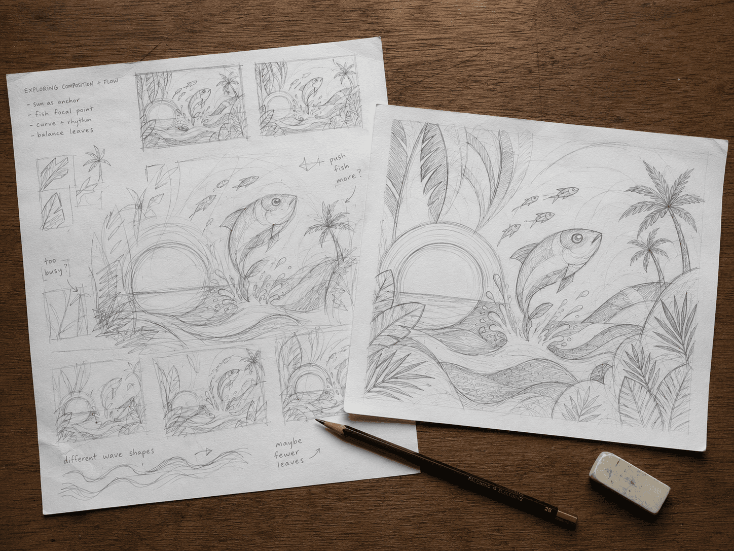
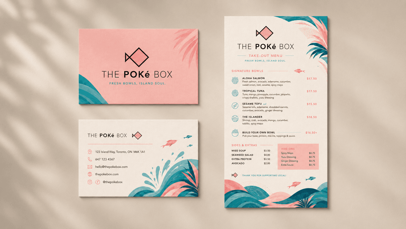
Poke Box is, in the end, a study in how brand can travel — from a logo on a wall, to a wave on a counter, to a feeling underfoot. The illustration system, the materials, the lighting all do the same work: they extend the brand's voice into every dimension of the space, so customers don't just eat here — they step into the brand's world. Good retail isn't about installing identity in a room; it's about designing a room that already knows how the brand wants to be felt.
Poke Box is, in the end, a study in how brand can travel — from a logo on a wall, to a wave on a counter, to a feeling underfoot. The illustration system, the materials, the lighting all do the same work: they extend the brand's voice into every dimension of the space, so customers don't just eat here — they step into the brand's world. Good retail isn't about installing identity in a room; it's about designing a room that already knows how the brand wants to be felt.
© KATHRYN XU
© 2026