04
ARTWELL — BRAND IDENTITY SYSTEM
ARTWELL — BRAND IDENTITY SYSTEM
ARTWELL — BRAND IDENTITY SYSTEM
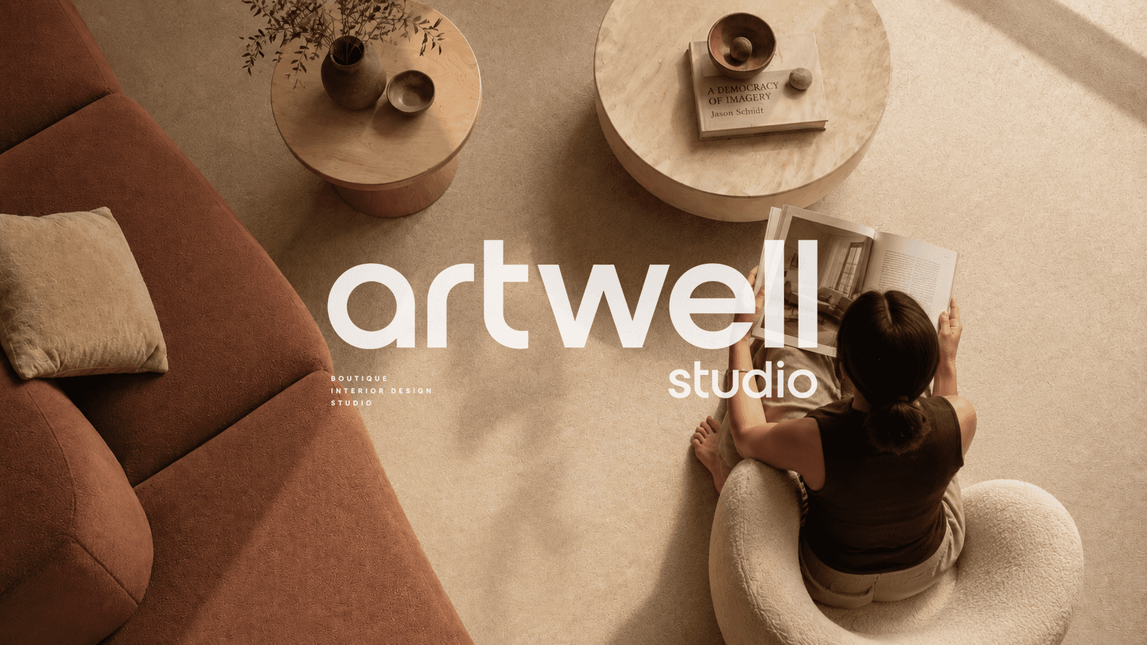
Artwell Studio is a Toronto-based interior design studio working across residential and commercial spaces. This rebranding project redefines the studio's visual identity — sharper, more editorial, and unapologetically considered. The new system bridges architectural precision with warmth: a brand that looks as intentional as the spaces it creates.
CLIENT
ARTWELL DESIGN STUDIO
ROLE
CREATIVE DIRECTOR & BRAND DESIGNER
RESPONSIBILITIES
BRAND STRATEGY / VISUAL IDENTITY / ART DIRECTION
YEAR
2026
ARTWELL DESIGN STUDIO
ARTWELL — BRAND IDENTITY SYSTEM
THE BRIEF
Artwell Studio's original identity was functional but incomplete — clean and minimal, yet missing the warmth and depth that truly reflects the studio's work. The brief was to evolve the brand: soften the visual language, introduce a richer color palette, and build an identity system that speaks to the lifestyle Artwell creates for its clients.
Artwell Studio's original identity was functional but incomplete — clean and minimal, yet missing the warmth and depth that truly reflects the studio's work. The brief was to evolve the brand: soften the visual language, introduce a richer color palette, and build an identity system that speaks to the lifestyle Artwell creates for its clients.
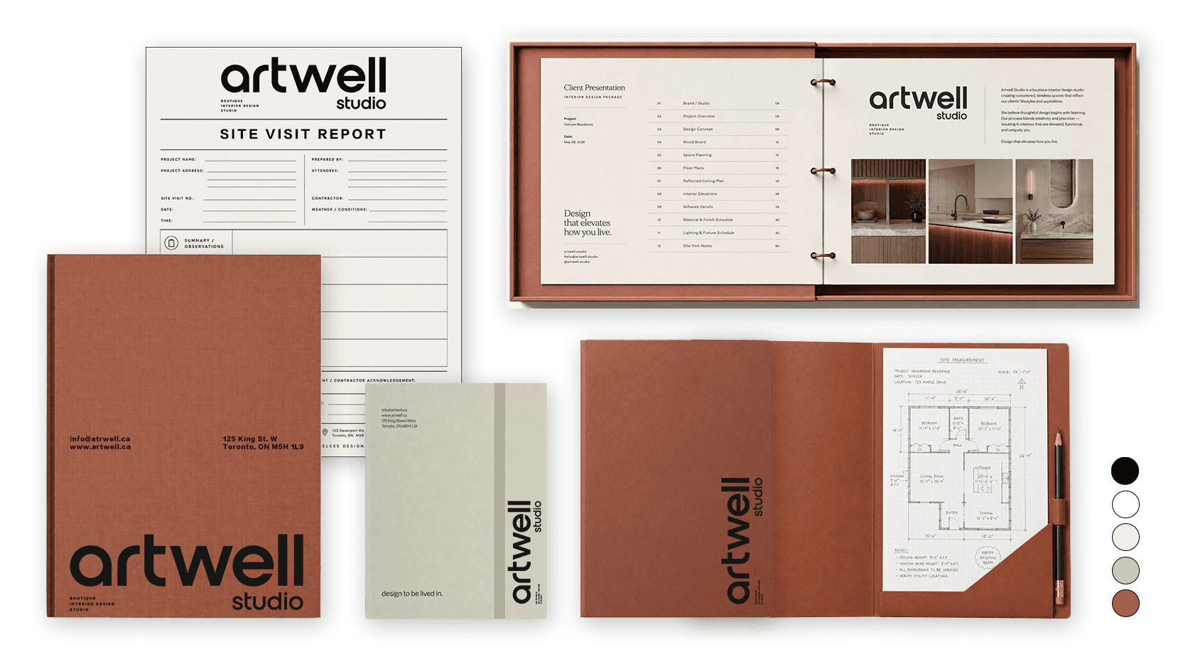
The existing black-and-white system was refined but cold. This rebrand introduces a warmer, more considered palette — grounded in terracotta, sage, and soft neutrals — to better represent the elevated, livable aesthetic at the core of every Artwell project. The result is a brand identity as thoughtful as the spaces it stands for.
The existing black-and-white system was refined but cold. This rebrand introduces a warmer, more considered palette — grounded in terracotta, sage, and soft neutrals — to better represent the elevated, livable aesthetic at the core of every Artwell project. The result is a brand identity as thoughtful as the spaces it stands for.
THE CONCEPT
The new Artwell identity is quietly confident — architectural in its clarity, warm in its detail. The color palette was drawn directly from the terracotta brick of the studio's own building and the earthy tones found throughout Artwell's projects, grounding the brand in the same materials and sensibility it brings to every space. Bold typography, restrained colour, and considered details come together in a visual system that feels timeless, livable, and unmistakably Artwell.
The new Artwell identity is quietly confident — architectural in its clarity, warm in its detail. The color palette was drawn directly from the terracotta brick of the studio's own building and the earthy tones found throughout Artwell's projects, grounding the brand in the same materials and sensibility it brings to every space. Bold typography, restrained colour, and considered details come together in a visual system that feels timeless, livable, and unmistakably Artwell.

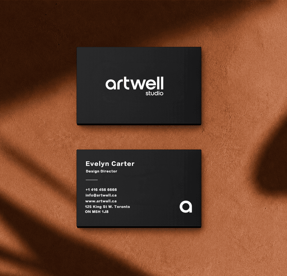
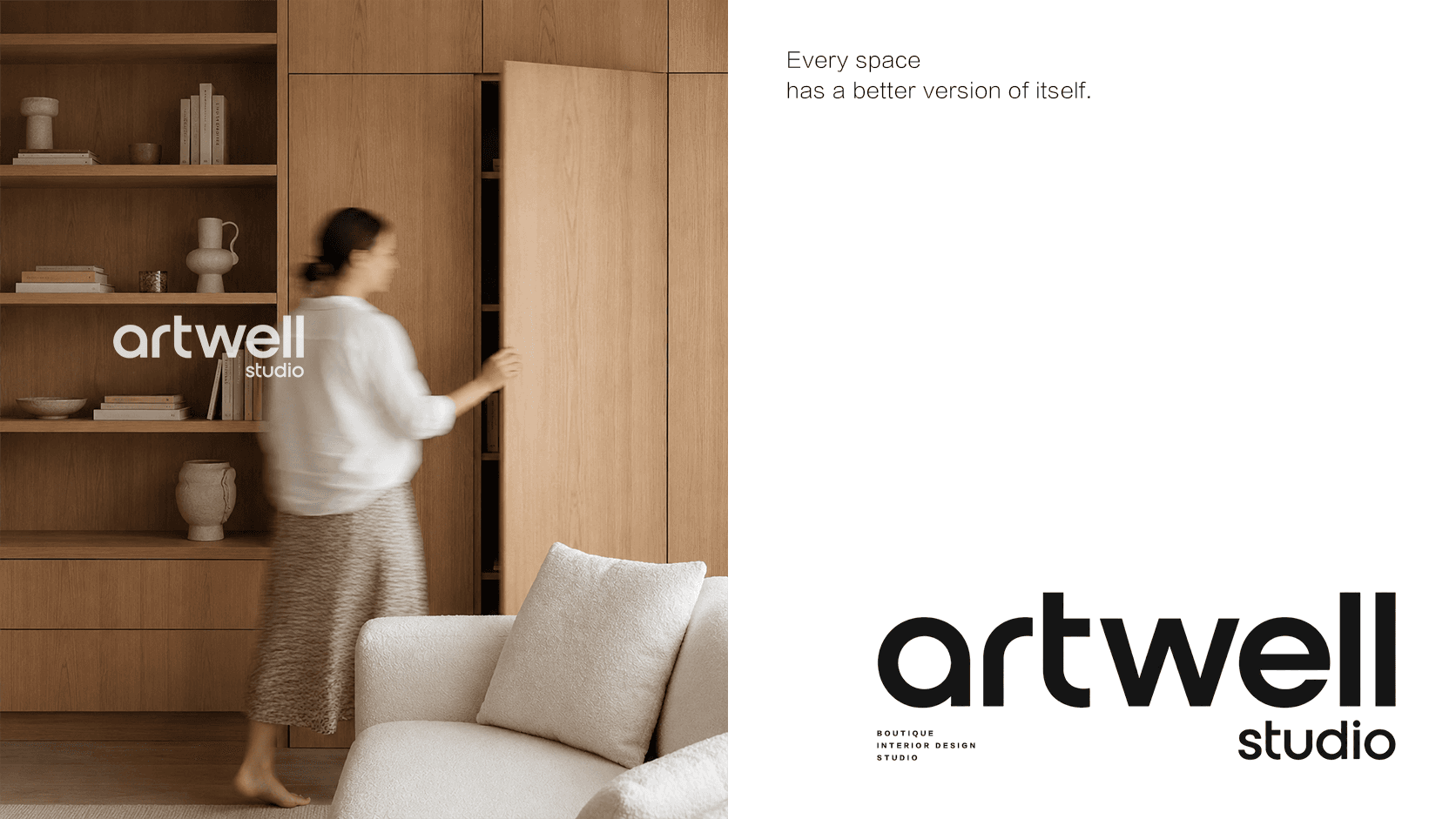
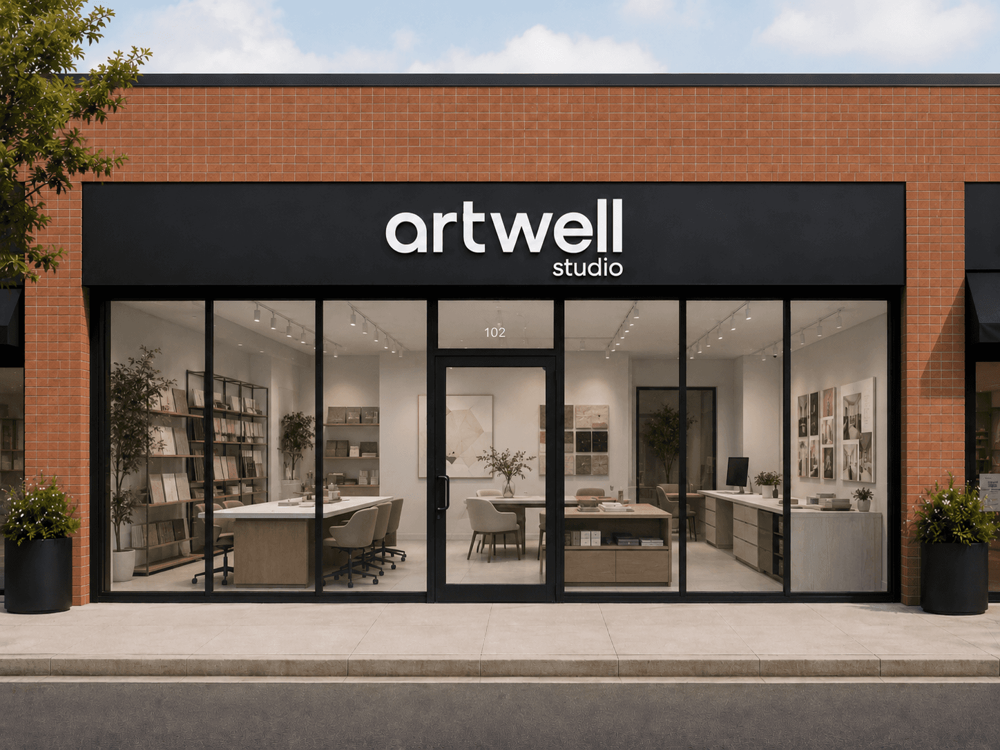
The brand lives beyond the page. Seeing the Artwell identity on a physical storefront — the same terracotta brick, the same quiet confidence — confirms that the system was built to scale, from a business card to a building facade.
The brand lives beyond the page. Seeing the Artwell identity on a physical storefront — the same terracotta brick, the same quiet confidence — confirms that the system was built to scale, from a business card to a building facade.
BRAND EXPERIENCE
The rebrand gave Artwell a visual identity that finally matches the quality of its work. A system that is warm without being soft, refined without being cold — and considered enough to grow with the studio for years to come.
The rebrand gave Artwell a visual identity that finally matches the quality of its work. A system that is warm without being soft, refined without being cold — and considered enough to grow with the studio for years to come.
© JACKELDER.DESIGN
© 2024