09

IMPERFECT FRESH EATS — BRAND INTEGRATION & STORE DESIGN

IMPERFECT FRESH EATS — BRAND INTEGRATION & STORE DESIGN

IMPERFECT FRESH EATS — BRAND INTEGRATION & STORE DESIGN

imPerfect Fresh Eats is a healthy food concept in North York, designed to give the brand a physical home that feels as fresh as what's on the menu. The project extends the brand's identity — honest, plant-forward, quietly elevated — into a full spatial experience built around a single architectural gesture: a threshold that transports guests from the street into a softer, greener interior the moment they step through.

CLIENT

IMPERFECT FRESH EATS

ROLE

SPATIAL DESIGN & BRAND INTEGRATION

LOCATION

TORONTO, ON

YEAR

2023

IMPERFECT FRESH EATS

IMPERFECT FRESH EATS — BRAND INTEGRATION & STORE DESIGN

THE BRIEF

imPerfect Fresh Eats approached me with a clear ambition: to design a fast-casual food space that didn't feel fast-casual. The brand is built on real ingredients, slow consideration, and a quiet kind of confidence — and the space needed to match. The brief called for an environment where guests would want to linger rather than grab and go, where the food, the brand, and the architecture would all speak the same language: clean, natural, and unmistakably alive.

imPerfect Fresh Eats approached me with a clear ambition: to design a fast-casual food space that didn't feel fast-casual. The brand is built on real ingredients, slow consideration, and a quiet kind of confidence — and the space needed to match. The brief called for an environment where guests would want to linger rather than grab and go, where the food, the brand, and the architecture would all speak the same language: clean, natural, and unmistakably alive.

A fresh food concept reimagined as an indoor garden — where stepping in feels like stepping out of the city for a moment.

A fresh food concept reimagined as an indoor garden — where stepping in feels like stepping out of the city for a moment.

THE CONCEPT

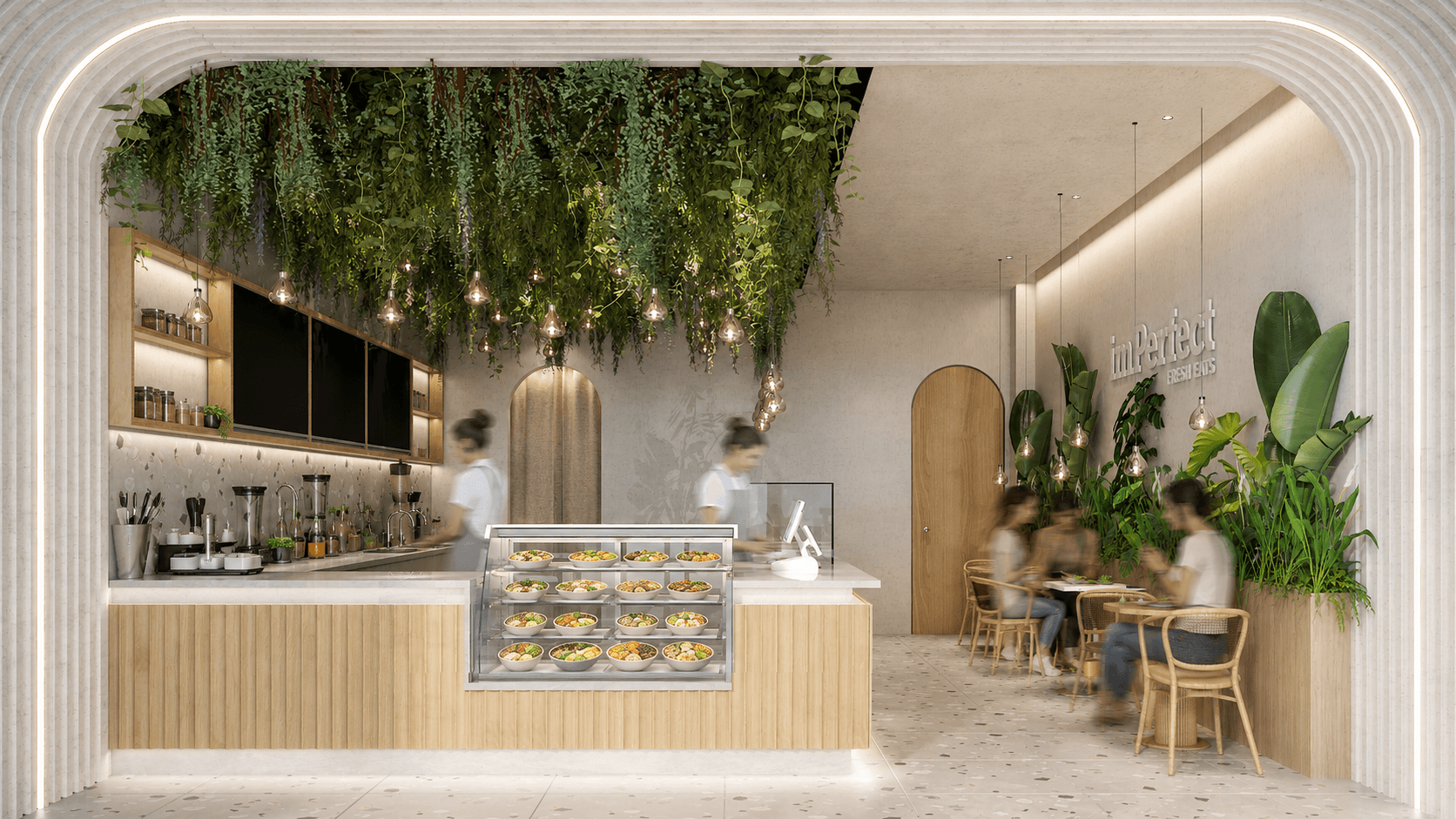
The concept treats the entrance as the experience itself. Rather than separating the front-of-house and dining areas with a wall, I carved an arched threshold draped in hanging greenery — a soft, sensory gateway that signals a shift the moment a guest crosses through. Inside, the space opens into a calmer, plant-filled interior held together by warm timber, off-white plaster, and pools of low, ambient light. Material and lighting do the work that walls usually do, defining zones through atmosphere rather than partition. The result is a space that mirrors the brand's own philosophy: nothing forced, nothing loud — just clean ingredients arranged with care.

The concept treats the entrance as the experience itself. Rather than separating the front-of-house and dining areas with a wall, I carved an arched threshold draped in hanging greenery — a soft, sensory gateway that signals a shift the moment a guest crosses through. Inside, the space opens into a calmer, plant-filled interior held together by warm timber, off-white plaster, and pools of low, ambient light. Material and lighting do the work that walls usually do, defining zones through atmosphere rather than partition. The result is a space that mirrors the brand's own philosophy: nothing forced, nothing loud — just clean ingredients arranged with care.

ONE VISUAL LANGUAGE, ACROSS EVERY TOUCHPOINT

Packaging, menus, and the space itself were designed to read as a single environment — so the brand stays consistent whether a guest is dining in, taking out, or holding the bag on their walk home.

The Counter as a Garden Set beneath a canopy of hanging plants, the counter was designed to dissolve the usual divide between service and dining — a quiet stage where ordering feels less like a transaction and more like the beginning of the meal.

The Counter as a Garden Set beneath a canopy of hanging plants, the counter was designed to dissolve the usual divide between service and dining — a quiet stage where ordering feels less like a transaction and more like the beginning of the meal.

DESIGNED TO SLOW DOWN

DESIGNED TO SLOW DOWN

Soft lighting, natural textures, and a calm acoustic backdrop were layered to gently shift the pace of the room — turning a quick lunch into a small moment of pause.

THE EXPERIENCE

imPerfect Fresh Eats was designed as a continuous extension of the brand, from the bowl on the table to the canopy overhead. By using a single architectural gesture — the green threshold — to carry guests from the city into a softer, slower interior, the space delivers the brand's message before a word is read or a dish is served. Behind the calm is a deliberate intention: to design an environment where eating well doesn't feel like a routine, but like a small daily ritual worth slowing down for.

imPerfect Fresh Eats was designed as a continuous extension of the brand, from the bowl on the table to the canopy overhead. By using a single architectural gesture — the green threshold — to carry guests from the city into a softer, slower interior, the space delivers the brand's message before a word is read or a dish is served. Behind the calm is a deliberate intention: to design an environment where eating well doesn't feel like a routine, but like a small daily ritual worth slowing down for.

© KATHRYN XU

© 2026